Product
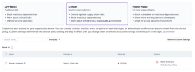
Announcing New Default Security Policies
Socket introduces three new customizable default security policies for users to choose from: Low Noise (traditional SCA), Default, and Higher Noise.
By Philipp Burckhardt - Aug 14, 2024
@shopify/polaris-tokens
Advanced tools
[](https://www.npmjs.com/package/@shopify/polaris-tokens)
Package description
@shopify/polaris-tokens is a package that provides design tokens for Shopify's Polaris design system. These tokens include values for colors, spacing, typography, and other design-related properties that can be used to ensure consistency across applications built with Polaris.
Color Tokens
Provides a set of predefined color tokens that can be used to maintain color consistency across your application.
{
"import": "import { color } from '@shopify/polaris-tokens';",
"usage": "const primaryColor = color['color-primary'];"
}Spacing Tokens
Offers a set of spacing tokens to ensure consistent spacing and layout throughout your application.
{
  "import": "import { spacing } from '@shopify/polaris-tokens';",
  "usage": "const smallSpacing = spacing['spacing-small'];"
}
Typography Tokens
Includes typography tokens for font sizes, weights, and other text-related properties to maintain typographic consistency.
{
  "import": "import { typography } from '@shopify/polaris-tokens';",
  "usage": "const baseFontSize = typography['font-size-base'];"
}Styled System provides a set of utilities for building design systems with responsive, theme-based style props. It offers similar functionality in terms of spacing, color, and typography tokens but is more flexible and can be used with various styling solutions like styled-components or emotion.
Tailwind CSS is a utility-first CSS framework that includes a comprehensive set of design tokens for colors, spacing, typography, and more. It is highly customizable and allows for rapid UI development with predefined utility classes.
Theme UI is a library for creating themeable user interfaces based on constraint-based design principles. It provides tokens for colors, spacing, and typography, similar to @shopify/polaris-tokens, but is designed to work seamlessly with React and MDX.
Readme

Design tokens for Polaris, Shopify’s design system.
Design tokens originated at Salesforce, and the best way to describe them is to simply quote their documentation:
Design tokens are the visual design atoms of the design system — specifically, they are named entities that store visual design attributes. We use them in place of hard-coded values (such as hex values for color or pixel values for spacing) in order to maintain a scalable and consistent visual system for UI development – Salesforce UX
npm install @shopify/polaris-tokens
Accessing all of the available token groups
// Token values only
import {tokens} from '@shopify/polaris-tokens';

console.log(tokens.color['color-bg']); // 'rgba(...)'

// Tokens with metadata
import {metadata} from '@shopify/polaris-tokens';

console.log(metadata.color['color-bg'].value); // 'rgba(...)'
console.log(metadata.color['color-bg'].description); // 'For use as a background color, in components such as Page and Frame backgrounds.'
Importing all of the css variables. CSS variables are prefixed with --p to signal that these variables are Polaris variables.
import '@shopify/polaris-tokens/css/styles.css';

div {
  background: var(--p-color-bg-surface);
}
Accessing a specific token group file via the dist folder
const spacing = require('@shopify/polaris-tokens/json/spacing.json');
Pull requests are welcome. See the contribution guidelines for more information.
FAQs
[](https://www.npmjs.com/package/@shopify/polaris-tokens)
The npm package @shopify/polaris-tokens receives a total of 82,379 weekly downloads. As such, @shopify/polaris-tokens popularity was classified as popular.
We found that @shopify/polaris-tokens demonstrated a healthy version release cadence and project activity because the last version was released less than a year ago. It has 24 open source maintainers collaborating on the project.
Did you know?

Socket for GitHub automatically highlights issues in each pull request and monitors the health of all your open source dependencies. Discover the contents of your packages and block harmful activity before you install or update your dependencies.
Product
Socket introduces three new customizable default security policies for users to choose from: Low Noise (traditional SCA), Default, and Higher Noise.

Security News
MITRE has just minted its 400th CNA, as the NVD struggles to tame its backlog of CVEs awaiting analysis, which has increased by 30% since June.

Security News
New report from the White House aims to address gaps in open source security, calling for more funding, tighter supply chain controls, and stronger collaboration.